Wednesday, March 16, 2011

Week 9 (TUTORIALS)


ACTIVITY 1 : (HUE/SATURATION)


1. Open image > use magic wand / lasso tools / marque tools to select any area that you want > select image > adjustments > hue / saturation.


BEFORE
AFTER

ACTIVITY 2 : (PATTERN)


1. Open image (for pattern) > crop pattern that you want from the image > select edit > define pattern.
2. Open image (to design pattern ) > select area that you want to fill the pattern (using selection tools such as marque tool / lasso tools / magic wand) > select edit > fill > insert pattern that you have created before.


BEFORE

AFTER
BEFORE

AFTER


ACTIVITY 3 : (COMBINE IMAGES)


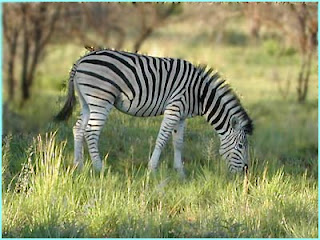
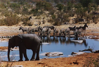
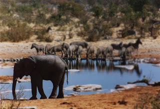
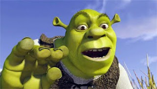
1. Open these 3 images > use selection tools and press delete to delete unnecessary object (for picture 1-toy story) > select image using marquee tools and move to right corner (for pic 1) > use magic wand tools to select 2nd picture and copy to picture 1 > use lasso tools for 3rd picture and copy to picture 1 > Lastly, insert text and line.


BEFORE


AFTER

ACTIVITY 4 : (BOKEH IMAGE)


1. Open image > select the area that you want to blur it > use blur tools and apply to the area that have been selected .


BEFORE AFTER
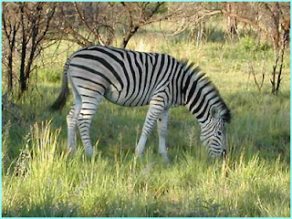
BEFORE
AFTER

ACTIVITY 5 : (CLONE STAMP)


1. Open image > use clone stamp tool > Insert clone stamp tool icon at the top of picture that you want to clone and hold press ALT and click > choose empty area of the same image and begin click to draw the clone picture.


BEFORE
AFTER

ACTIVITY 6 : (FILTERS)


1. Open image > select filters > artistic > colored pencil (choose any effect)


BEFORE

AFTER


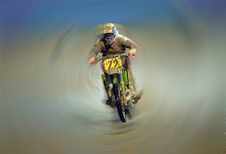
1. Open image > select filters > blur > radial blur (choose any effect)


(USING FILTER - BLUR)


BEFORE
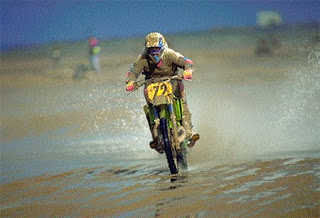
AFTER
ACTIVITY 7 : (AUTO-ALIGN LAYERS)


1. Create an image stack > select file > scripts > load files into stack > select 2 images (below)
2. Click one of the layer and shift click on other layer to select > choose edit > auto-align layers (in the dialog, choose auto.
3. Choose edit > auto-blend layers > select crop tool to crop uneven edges.


BEFORE


AFTER


Tuesday, March 8, 2011

WEEK 9 (REFLECTION)


1. Why do we need to set the file as pixel or inches? Is there any difference between these two?


ANSWER : We set pixel for viewing and inches for printing.

2. What happen if one set the dpi more than 72 dpi? Can your eyes see the differences?

ANSWER : We cannot see the difference when viewing from the monitor but it will show the difference if you print out the image.

3. What are the tools used for selection and its function?

ANSWER : Tools used for selection is called marque tools.There are 4 marque tools (rectangular, elliptical, single row and single column). the function of this tools is to select any part of the image.

4. How the use of glossy paper able to fool one's eyes?

ANSWER : The reflection of the glossy paper.


Hue/Saturation, Level, Curve


1. Why it is advisable to use Level / Curve compared to Brightness / Contrast?

ANSWER : Level is a lot faster than brightness and contrast, because everytime you adjust brightness you will have to readjust contrast and vice versa to get the range. With levels, you can set the darkest areas and lightest areas and then adjust midtone. Readjusting midtones does not require adjusting the black and white sliders, the way adjusting contrast or brightness would require going back and adjusting the other. Curves, are like graphic equalizers, and allow different weighting of different colour ranges. With curves, for example, you can brighten shadows without effecting midtones. That is why it is advisable to use level/curve rather than brightness / contrast.


2. Figure 2A is a picture of model trucks and cars. It is desired to change the color of the bulldozer from yellow to green. Using the Hue/Saturation adjustment seen in Figure 1, the Edit drop down box was changed to Yellows. Then the eyedropper tool, circled in red in Figure 1, was selected and clicked on the bulldozer only. The Hue slider was then moved to the right until the desired color was achieved. In this case, +62. However, as seen in Figure 2B, the car was also changed to green.

Why did the color of the car change when the eyedropper was only clicked on the bulldozer?

ANSWER : Color of the car is same with the color of bulldozer. So, when you apply eyedropper on bulldozer , it will automatically change the colour of the car.

Wednesday, February 23, 2011

INTRODUCTION TO ADOBE PHOTOSHOP CS3

INTRODUCTION.


Today's lesson we heve been introduced to photoshop. For beginner, we will be using Adobe photoshop CS3. We also has been introduced to some of the tools in photoshop. Here, i found a video about the tools in photoshop. Check it out...


Saturday, February 19, 2011

DEPTH OF FIELD (D.O.F)

Depth of field is the amount of distance between the nearest and farthest objects that appear in acceptably sharp focus in a photograph. A preferred selection Depth of field ("DOF") in a focused subject in an image can be quite subjective.


f/5.6, 1/40 sec, ISO = 800


Three factors can affect the depth of field:

I. focal length of the lens

II. distance from the camera to the subject

III. the size of the aperture or the setting of the f-stop

I. Focal Length Of The Lens

The depth of field is inversely proportional to the focal length of the lens; that is, the smaller the focal length number of the lens, the greater the depth of field. For example, a 28mm lens has the ability to capture more of the picture in sharp focus than a 100mm lens.

II. Distance from the camera to the subject

Depth of field is directly proportional to distance; i.e. a subject at a greater distance will have greater depth of field than a close-up subject. Therefore, you need not worry as much about a distant subject being out of focus.

III. The size of the aperture or (f-stop)

While changing the aperture (f-stop) will not have a striking effect on the depth of field for a distant subject or a wide angle (short focal length) lens, it can make a great deal of difference in a close-up or a photo taken using a telephoto or zoom lens.

A wider aperture (smaller f-stop number) will result in a shallower depth of field. You can use this to keep either the foreground or background out of focus while maintaining the subject in focus. When changing the aperture setting, you will need to also adjust the shutter to maintain the correct exposure.


Aperture = F5.6
Shutter = 1/1000

Little/Shallow depth of field


Aperture = F22
Shutter = 1/60

Greater/More depth of field


CLASS ACTIVITY: COMPOSITION GUIDELINES


COMPOSITION IN PHOTOGRAPHY
  • Good Composition is a key element of good photographs yet is something that is hard to define.

Good Composition Guidelines in Photography:

1. Simplicity
  • Look for ways to give the center of interest in your pictures the most visual attention.
  • One way is to select uncomplicated backgrounds that will not steal attention from your subjects.
f/5.6, 1/320 sec, ISO = 200


f/5, 1/500 sec, ISO = 400


2. The Rule of Thirds
  • The rule states that an image should be imagined as divided into nine equal parts by two equally-spaced horizontal lines and two equally-spaced vertical lines, and that important compositional elements should be placed along these lines or their intersections.
f/36, 1/125 sec, ISO = 400


f/5, 1/4000 sec, ISO = 400


3. Lines
  • You can use diagonals as leading lines to provide a way into the picture. It's a simple and easy path for the eye to follow to the main subject. You can also use repetitive lines to draw viewers' attention to your center of interest. One of the most common and graceful lines used in composition is called the S curve.

f/5.6, 1/400 sec, ISO = 200


f/5.6, 1/1000 sec, ISO = 200


4. Balance

• Good balance is simply the arrangement of shapes, colors, or areas of light and dark that complement one another so that the photograph looks well-balanced.

f/11, 1/640 sec, ISO = 200


5. Framing
  • Sometimes you've a object of huge dominance within a scene.
  • While breathtaking on-location, the final picture looks often much less impressive due to uninteresting space around the object.
  • Try to find a frame which can eliminate the unimportant surrounding and focus the view.
A frame serves numerous purposes:
  • It gives the image depth and helps to give the perception to viewers of it that they’re looking at something that is more than 2 dimensions.
  • Framing can add context to a shot.

f/5, 1/1250 sec, ISO = 200


f/5.3, 1/4000 sec, ISO = 200


Saturday, February 12, 2011

ASSIGNMENT 1

INCORRECT AND CORRECT IMAGES
(AT LEAST 6 IMAGES)

1. SPACE

f/13, 1/500 sec, ISO-400

f/20, 1/500 sec, ISO-400


2. INCORRECT SHUTTER SPEED

f/7.1, 1/500 sec, ISO-1600


f/7.1, 1/1000 sec, ISO-1600

3. OVER EXPOSE


f/7.1, 1/8 sec, ISO-100


f/7.1, 1/50 sec, ISO-100


4. INCORRECT FRAMING

f/14, 1/200 sec, ISO-200


f/14, 1/200 sec, ISO-200


5. INCORRECT DEPTH OF FIELD


f/14, 1/30 sec, ISO-200

f/14, 1/30 sec, ISO-200


6. OVER EXPOSE
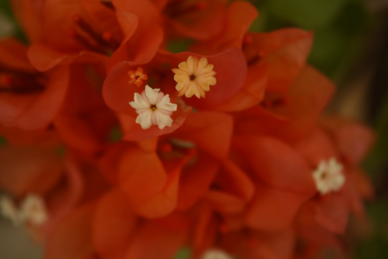

f/7.1, 1/320 sec, ISO-1600


f/7.1, 1/1600 sec, ISO-1600


7. INCORRECT ANGLE


f/8, 1/40 sec, ISO-1600


f/5, 1/50 sec, ISO-1600


8. INCORRECT ISO


f/5.6 1/80 sec, ISO-200


f/18, 1/80 sec, ISO-100

9. UNDER EXPOSE

f/5.6, 1/125 sec, ISO-100


f/5, 1/125 sec, ISO-400


LANDSCAPE (AT LEAST 4 IMAGES)

f/5.6, 1/1400 sec, ISO-200

f/14, 1/250 sec, ISO-1600


f/8, 1/800 sec, ISO-200


f/9, 1/200 sec, ISO-200

POTRAIT (AT LEAST 2 IMAGES)

f/5, 1/10 sec, ISO-200

f/5, 1/13 sec, ISO-200

MACRO (AT LEAST 2 IMAGES)


f/5.6, 1/125 sec, ISO-100

f/5.6, 1/40 sec, ISO-100